Brief
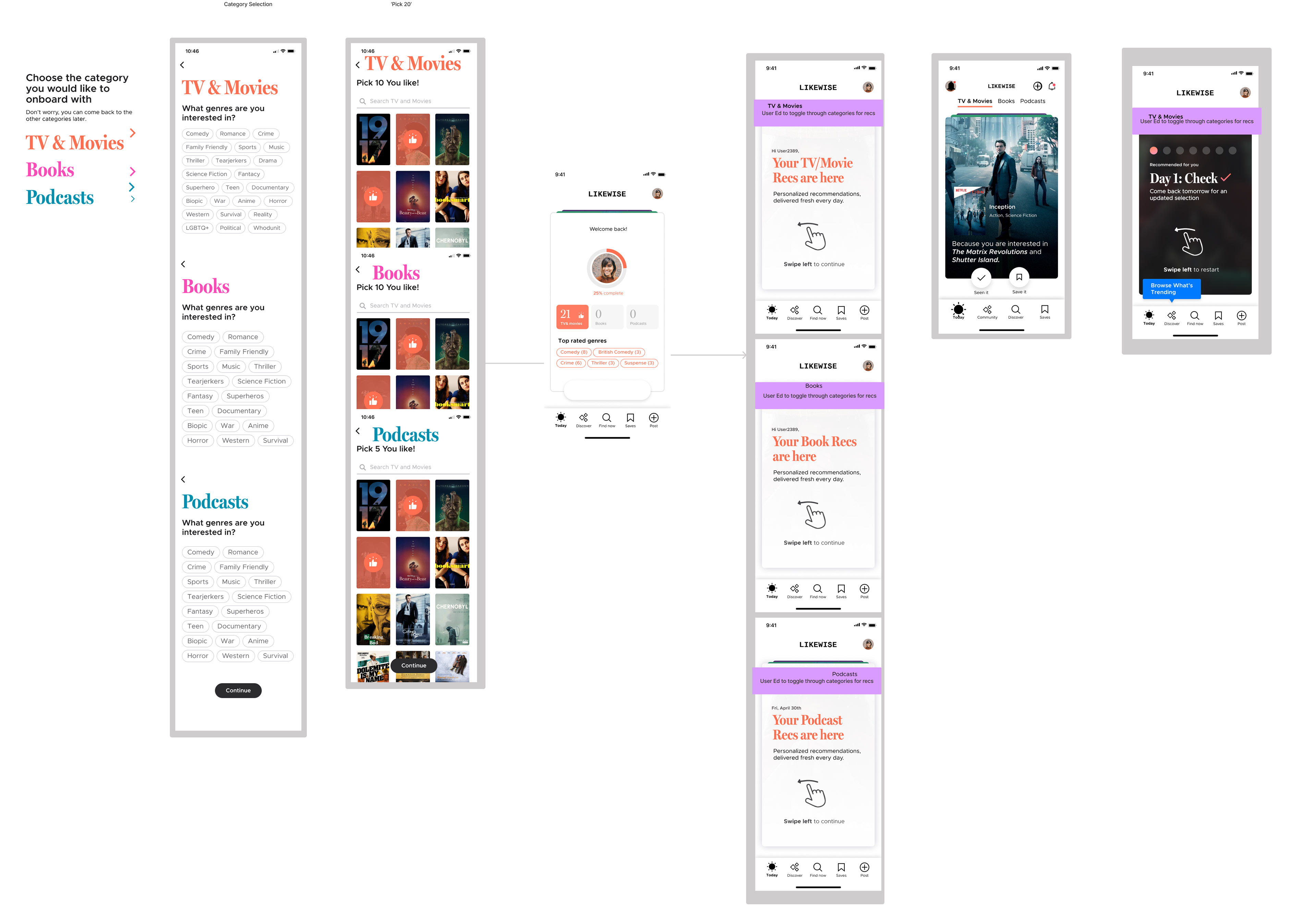
Optimize the 'Today' tab where people get daily personalized recommendations based on genre and likes from unlocked categories (TV & movies, books, podcasts).
Problem
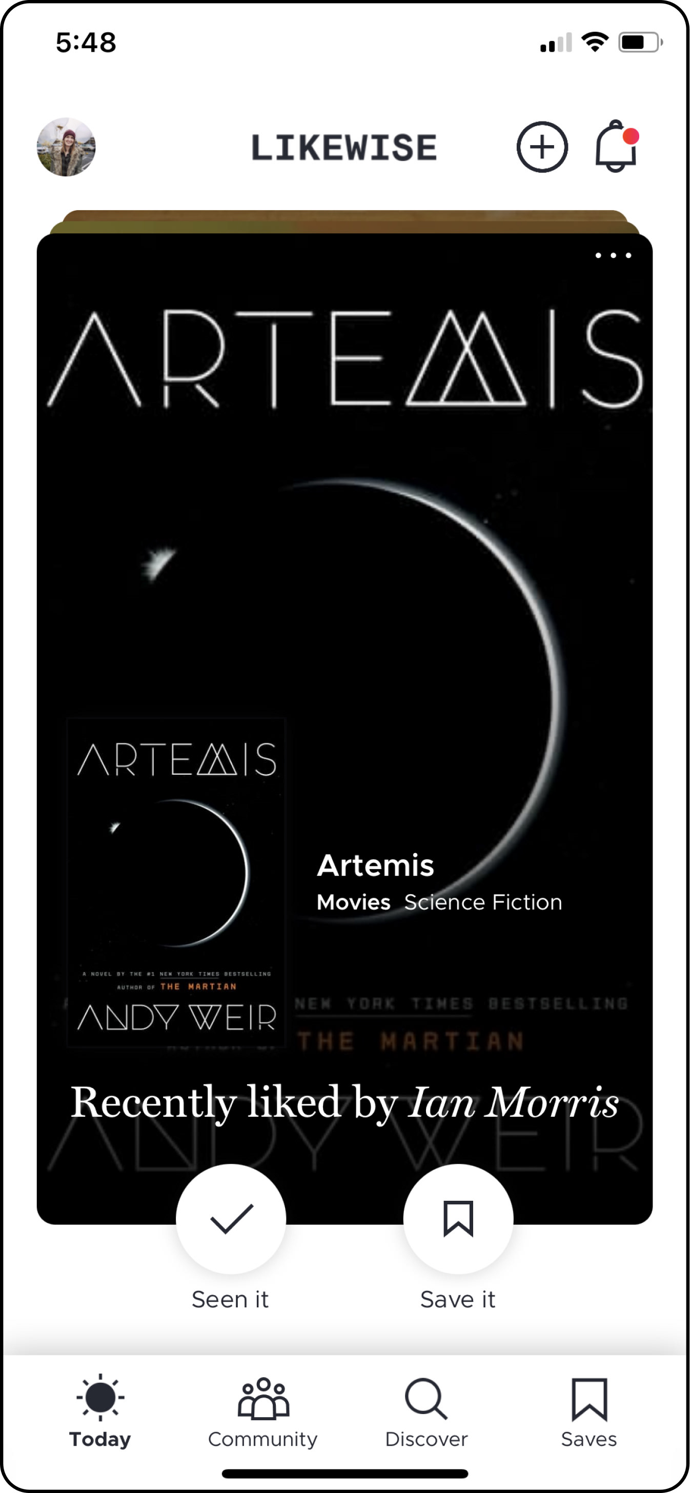
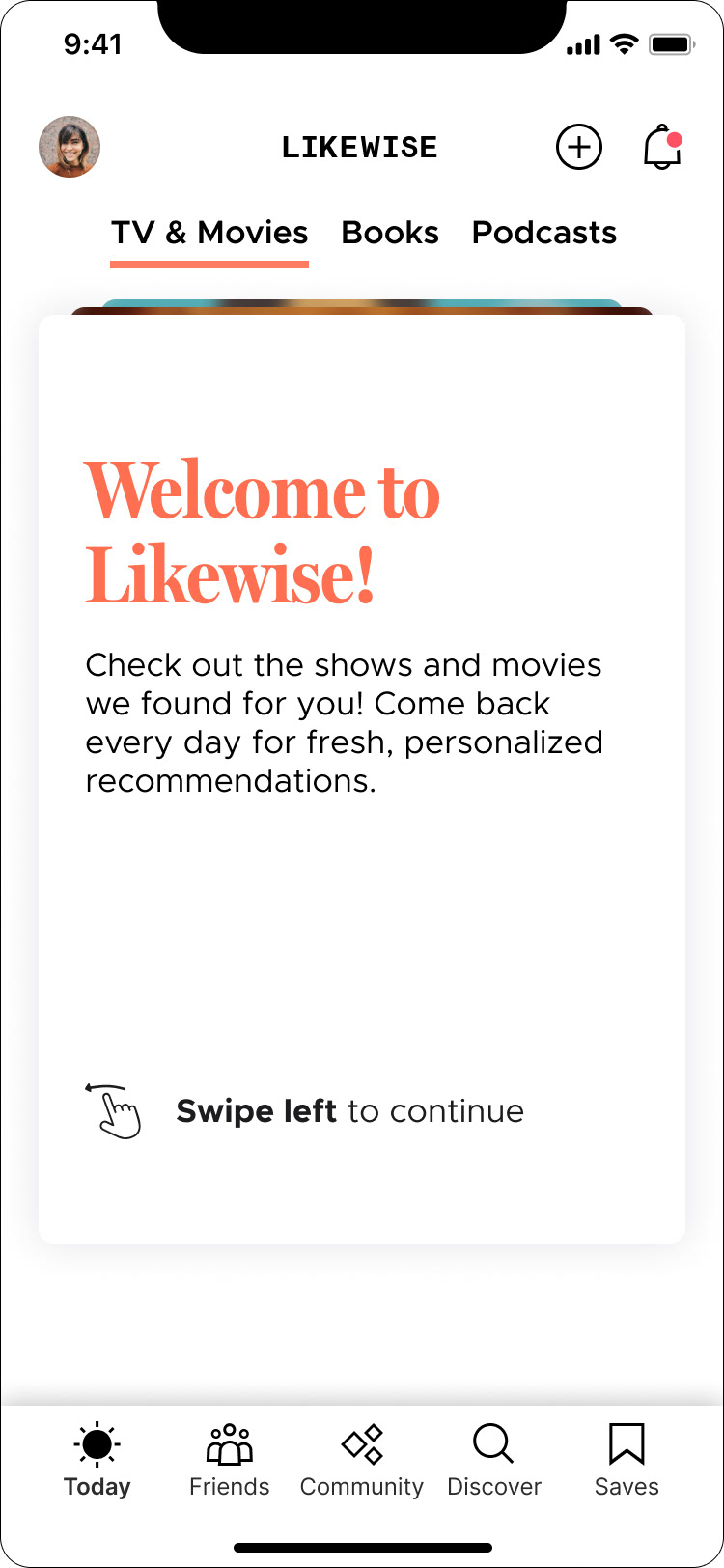
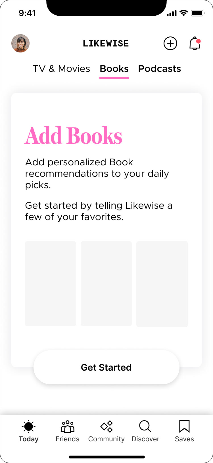
The 'Today' tab in the Likewise app is where people get daily personalized recommendations from their favorite categories based on genre, likes, and people you follow.
The section was seeing sluggish retention numbers for day zero. Users who unlocked more than one category in their first day on the app were retained longer than users who only unlocked one category (TV & movies, books & podcasts) but current onboarding infrastructure could only support unlocking one category at a time.
How could we surface unlocking multiple categories at the top of the funnel in the live app?
Likewise Mobile App: Today Tab
My Role
I collaborated with another designer throughout the whole process. My main contribution included: Day 0 audits, comp-analysis, testing, user flows, personas, wireframing, and interactive designs.
Credit goes to: Lead UX/UI Designer Israel Lemus
Credit goes to: Lead UX/UI Designer Israel Lemus
Research | Metrics
We scheduled a kickoff meeting with our product manager and UX researcher to learn more about the metrics and qualitive data. Our UX researcher pointed us to some pre-recorded user videos and we began going through them and noting user behaviors to understand what roadblocks or frustrations they were having.
The Today tab touched the onboarding flow and the user profile, which are big flows. For this reason, it was crucial to avoid scope-creep in order to correctly measure changes post launch.
Research | User Journey Audit
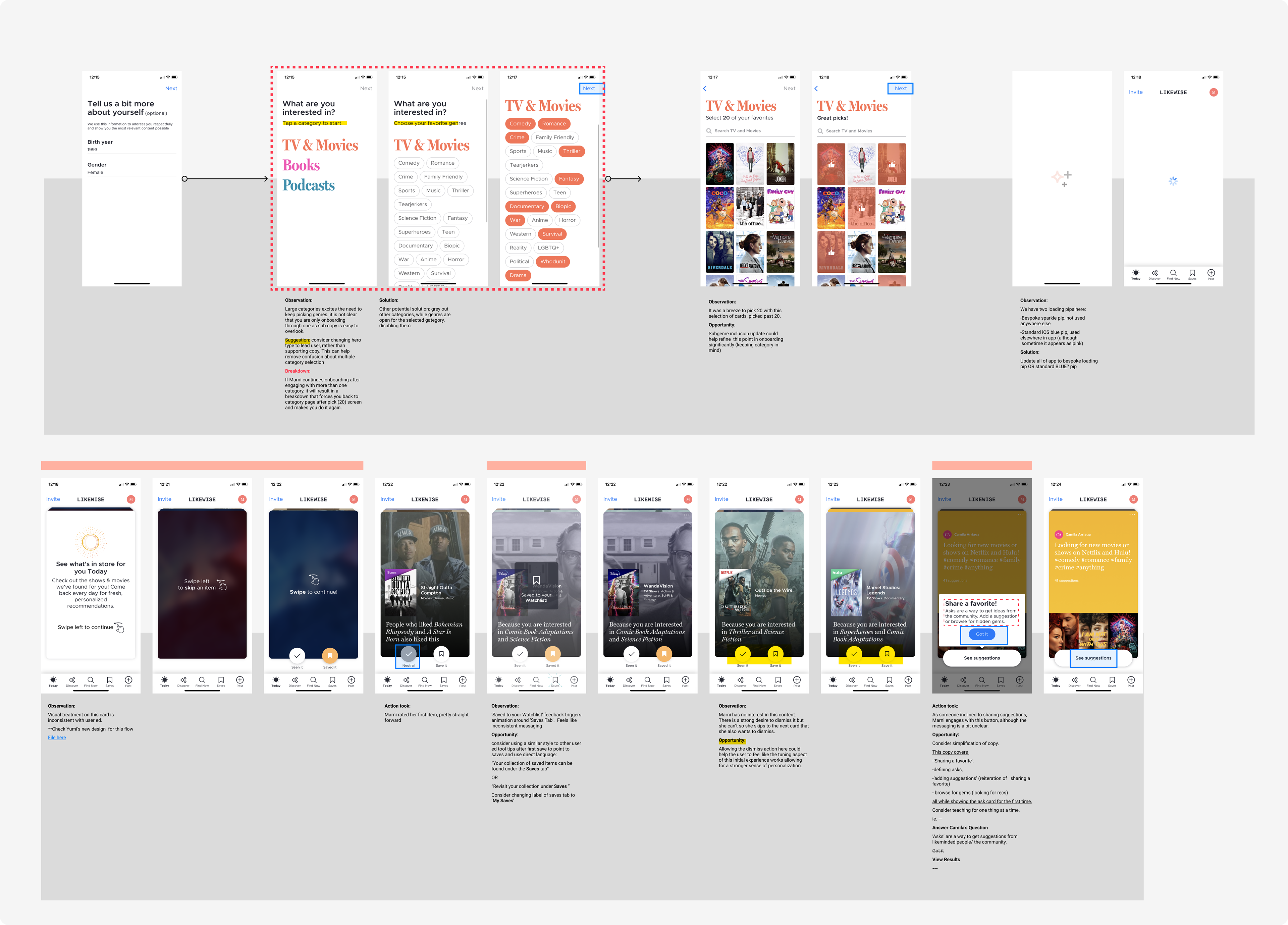
I audited the current first time user experience and pointed out any obvious roadblocks.
Part of user journey audit
Research | Competitive Analysis
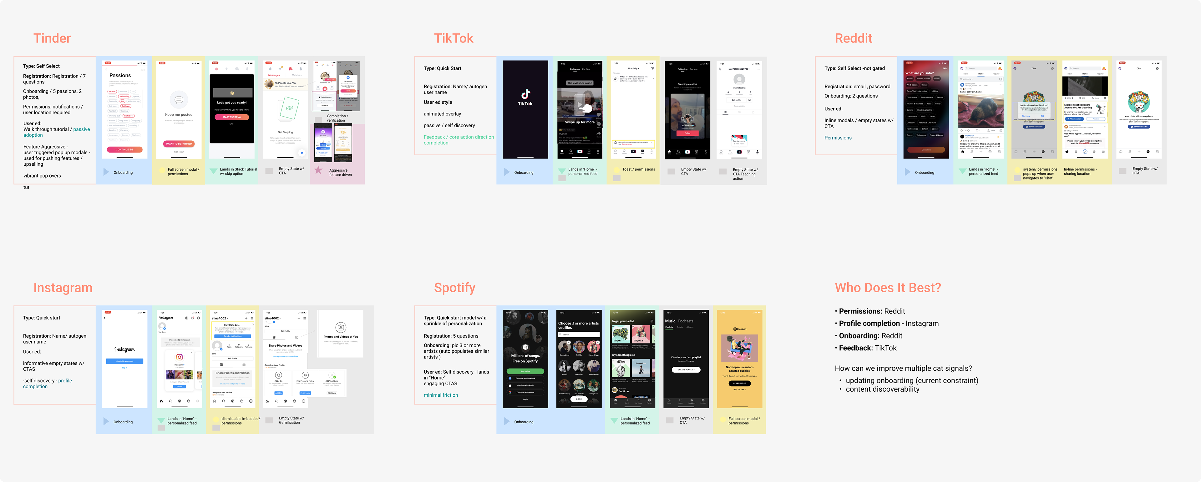
Comping direct and adjacent competitors informed of any new and intuitive patterns that could be leveraged.
Synthesis
Here are the top things that we learned:
People who unlock multiple categories have a more positive experience in the product.
Our current onboarding constraints only allowed users to onboard through one category at a time. Because of this, many users never unlocked more than one.
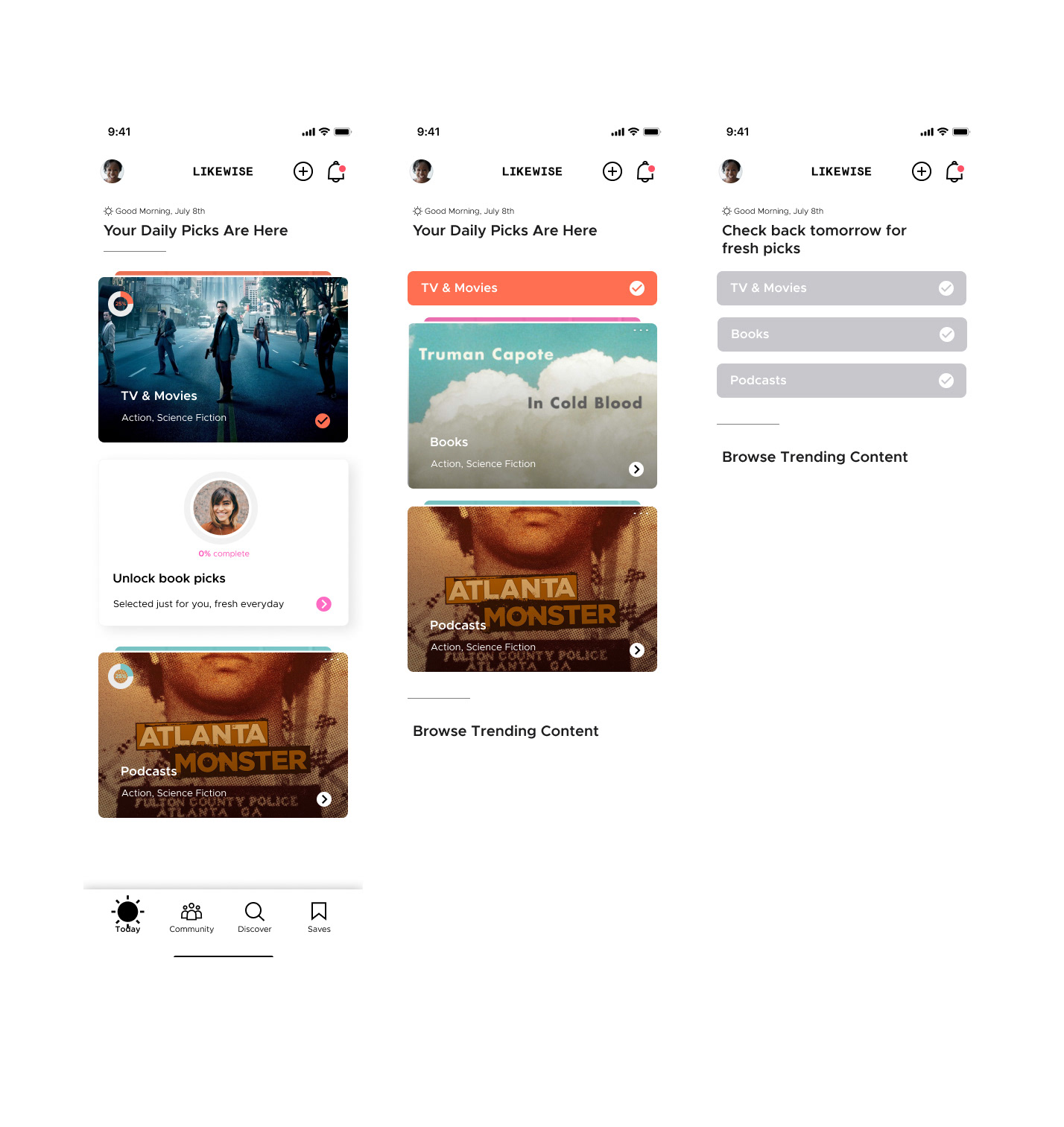
There was no clear organization of recommendations and the experience broke down when users tried to figure out how to get back to their recommendations and settings.
User who engaged with all of their recommendations for the day would leave the app instead of explore other tabs. This showed a clear lack of indicators in the user flow* opportunity to improve discoverability.
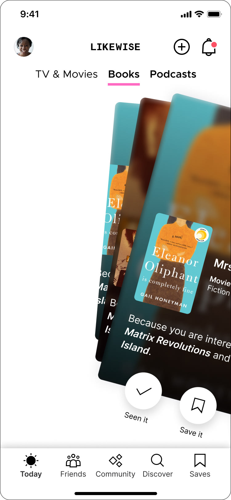
The interactions in the recommendation card stack were busted and didn’t reinforce a good experience.
This wider range of cross-category recommendations brought a higher value to people which also caused a higher engagement during each session. However, the number of people with multiple unlocked categories was low.
People who unlock multiple categories have a more positive experience in the product.
Our current onboarding constraints only allowed users to onboard through one category at a time. Because of this, many users never unlocked more than one.
There was no clear organization of recommendations and the experience broke down when users tried to figure out how to get back to their recommendations and settings.
User who engaged with all of their recommendations for the day would leave the app instead of explore other tabs. This showed a clear lack of indicators in the user flow* opportunity to improve discoverability.
The interactions in the recommendation card stack were busted and didn’t reinforce a good experience.
This wider range of cross-category recommendations brought a higher value to people which also caused a higher engagement during each session. However, the number of people with multiple unlocked categories was low.
Audience
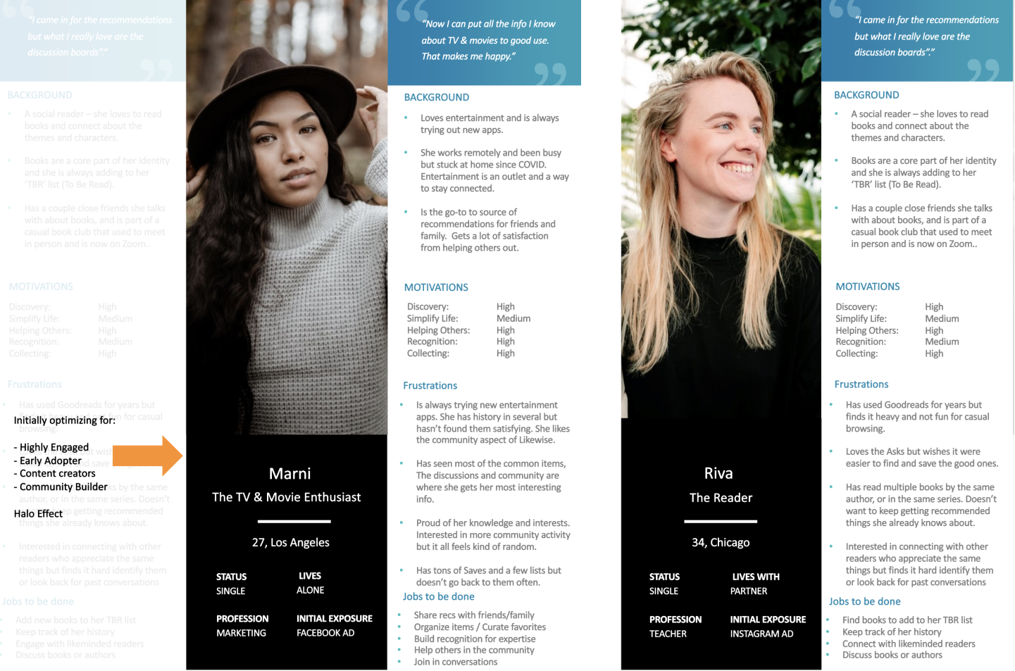
To stay aligned with business goals, we optimized the experience for two personas:
Early adopters who are highly invested in getting recommendations for books and TV & movies
People who are interested in building community
Likewise Initial user personas
Exploration
While brainstorming a range of mid-fidelity ideas, we focused on:
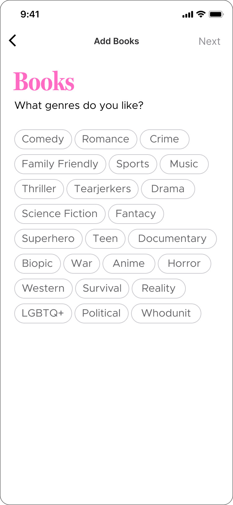
streamlining onboarding to allow for multiple categories to be unlocked
streamlining onboarding to allow for multiple categories to be unlocked
simplifying the flow and removing roadblocks that prevent users from viewing all recommendations from each category (locked or unlocked)
organizing recommendations by category to to give users more control over their experience
organizing recommendations by category to to give users more control over their experience
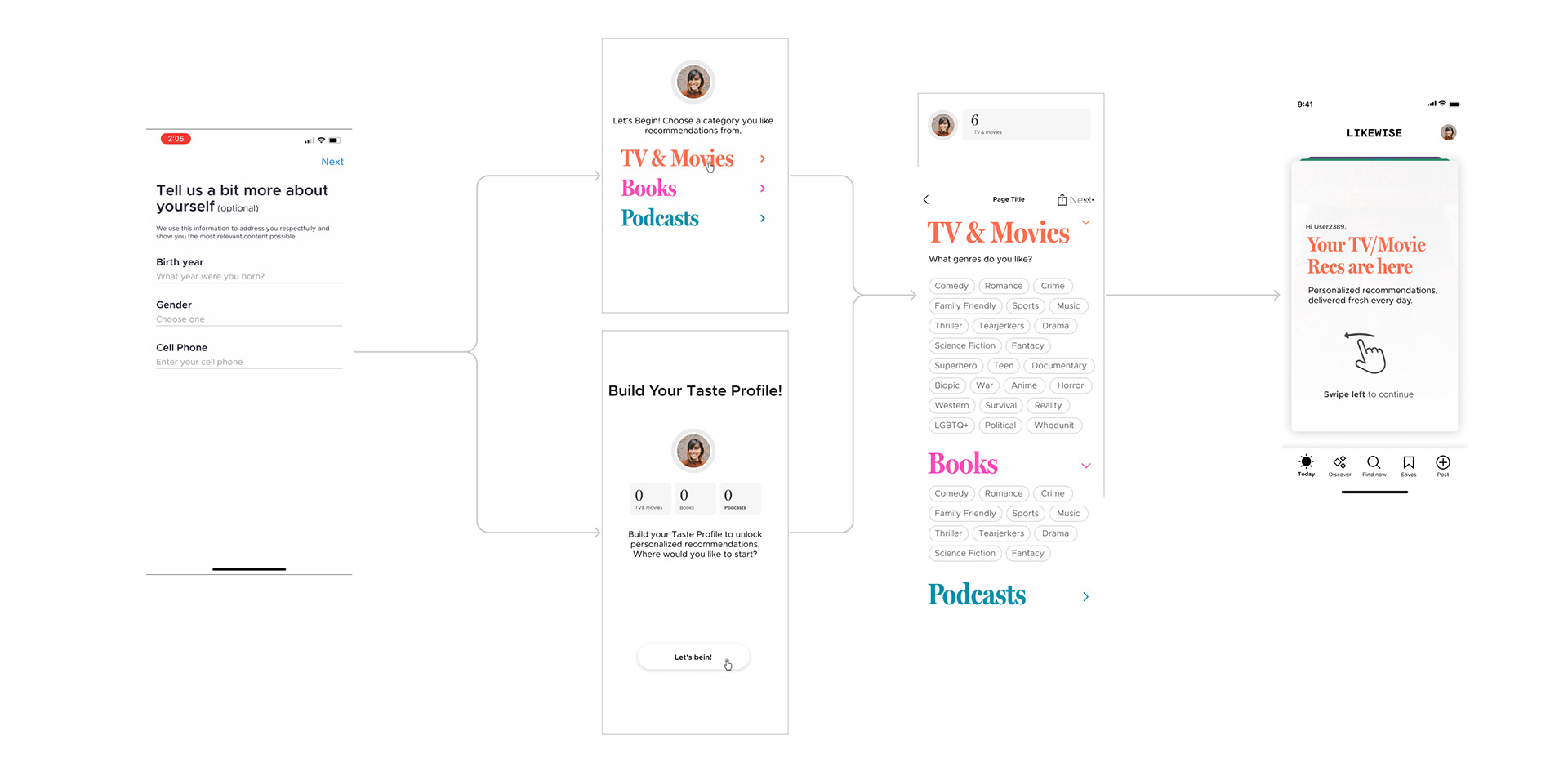
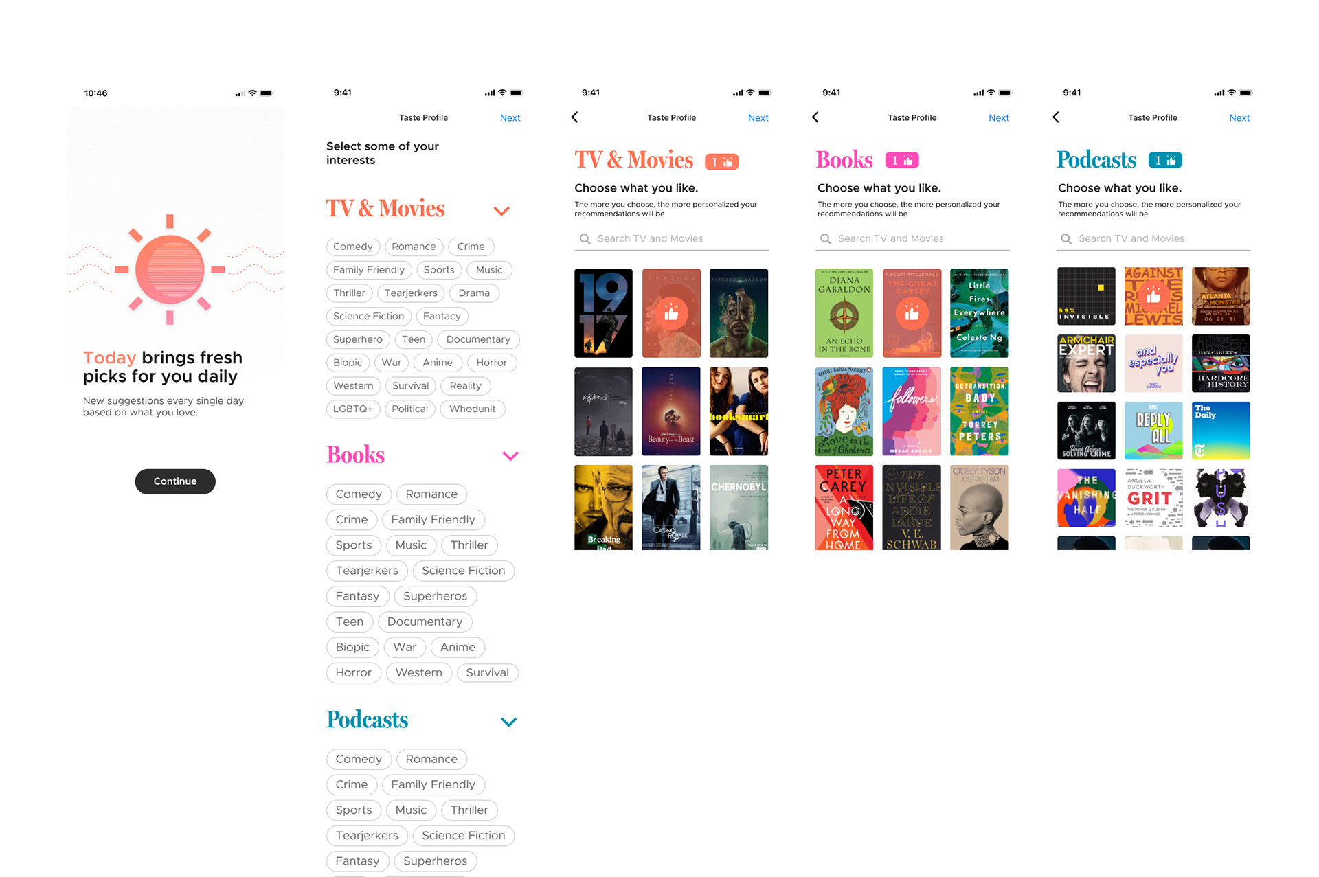
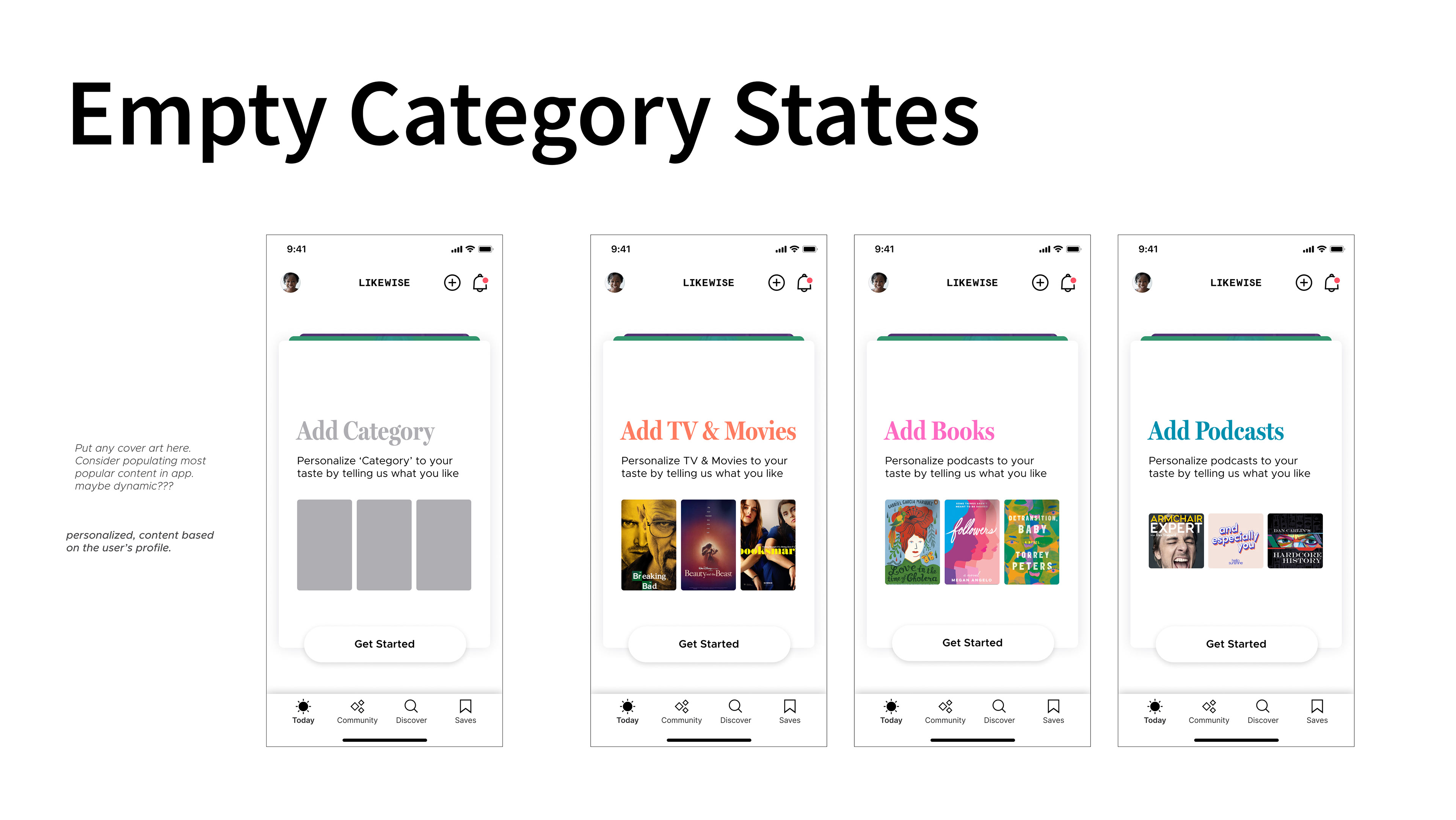
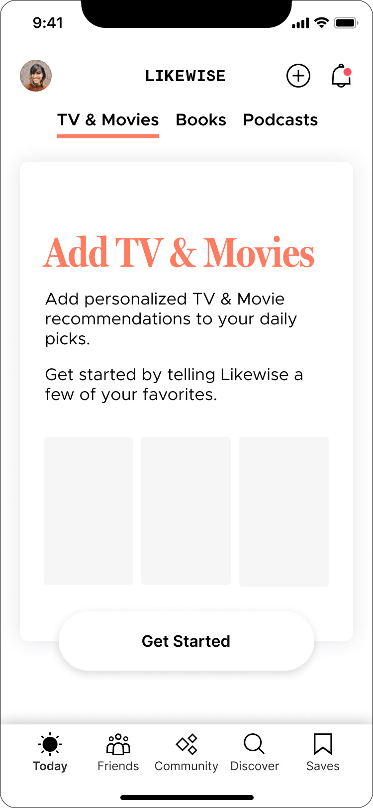
User Education
User Onboarding
User Profile; Custom Cards; Header Navigation
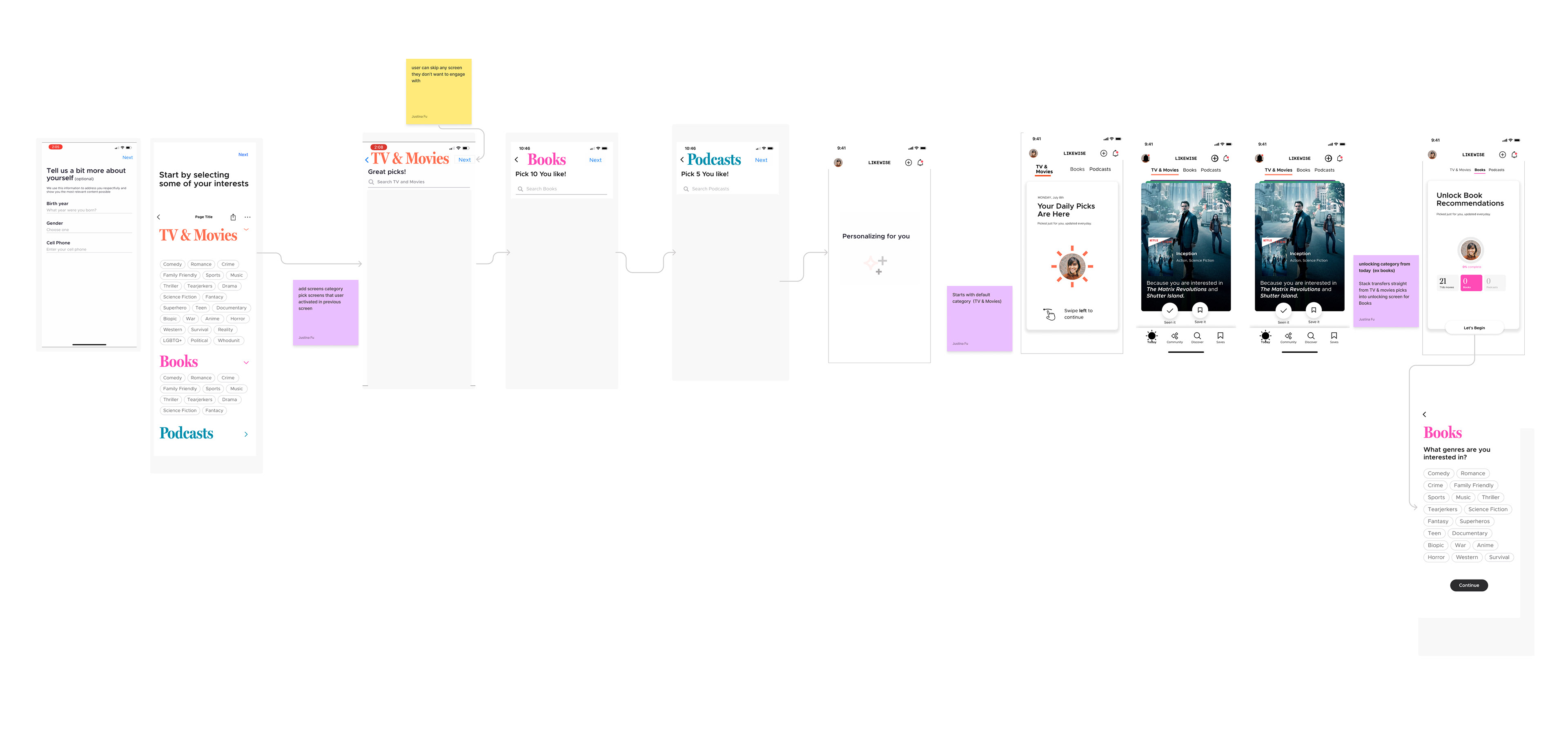
Iteration
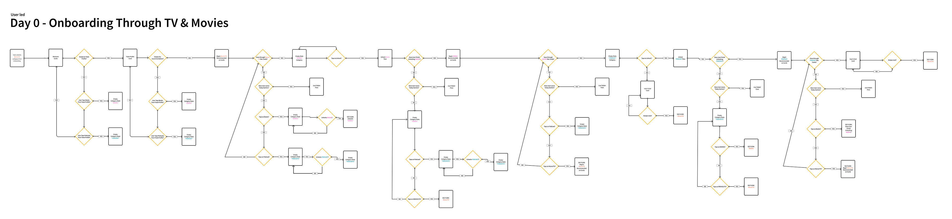
After reviewing and approval, the approved flow was wireframed flow to insure a consistent and foolproof user experience. We connected with the developer to walkthrough the scenarios and come up with a testing plan.
Loop Diagram
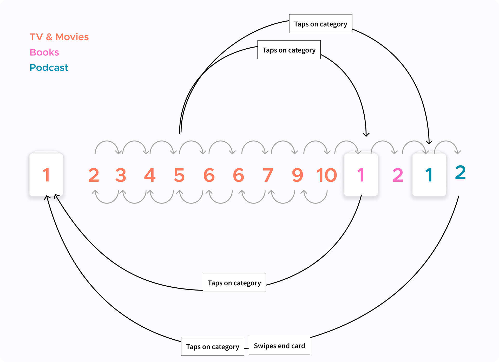
User Loop Flow
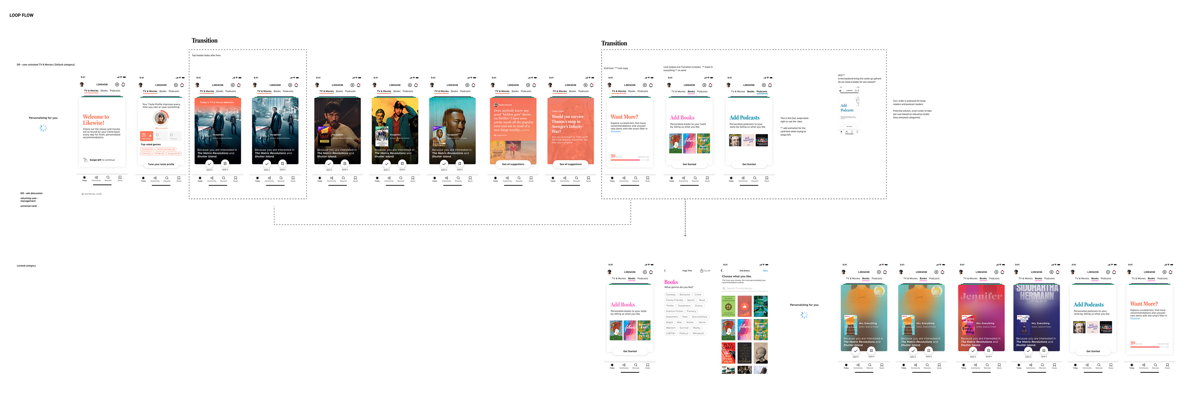
Wireframe
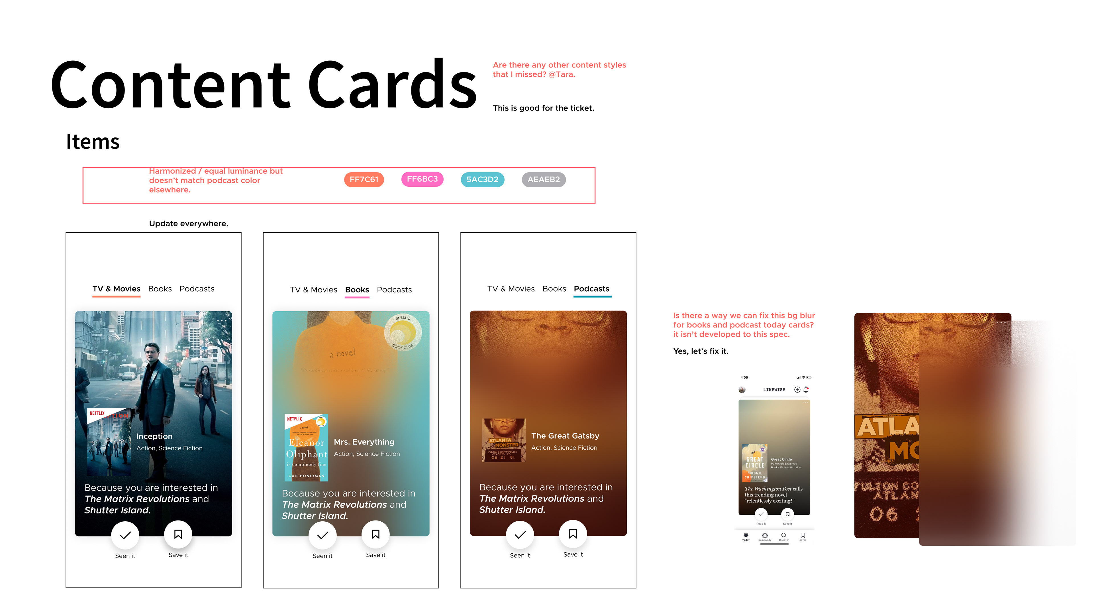
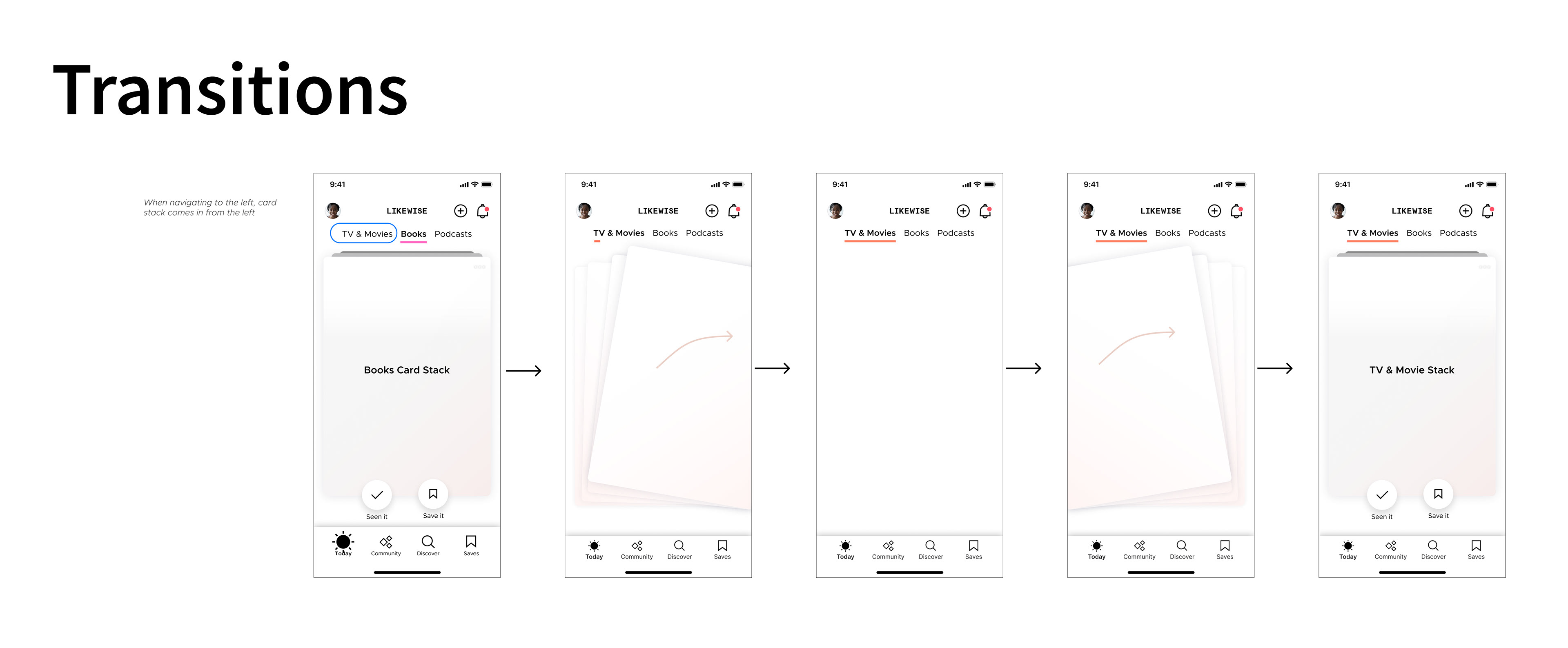
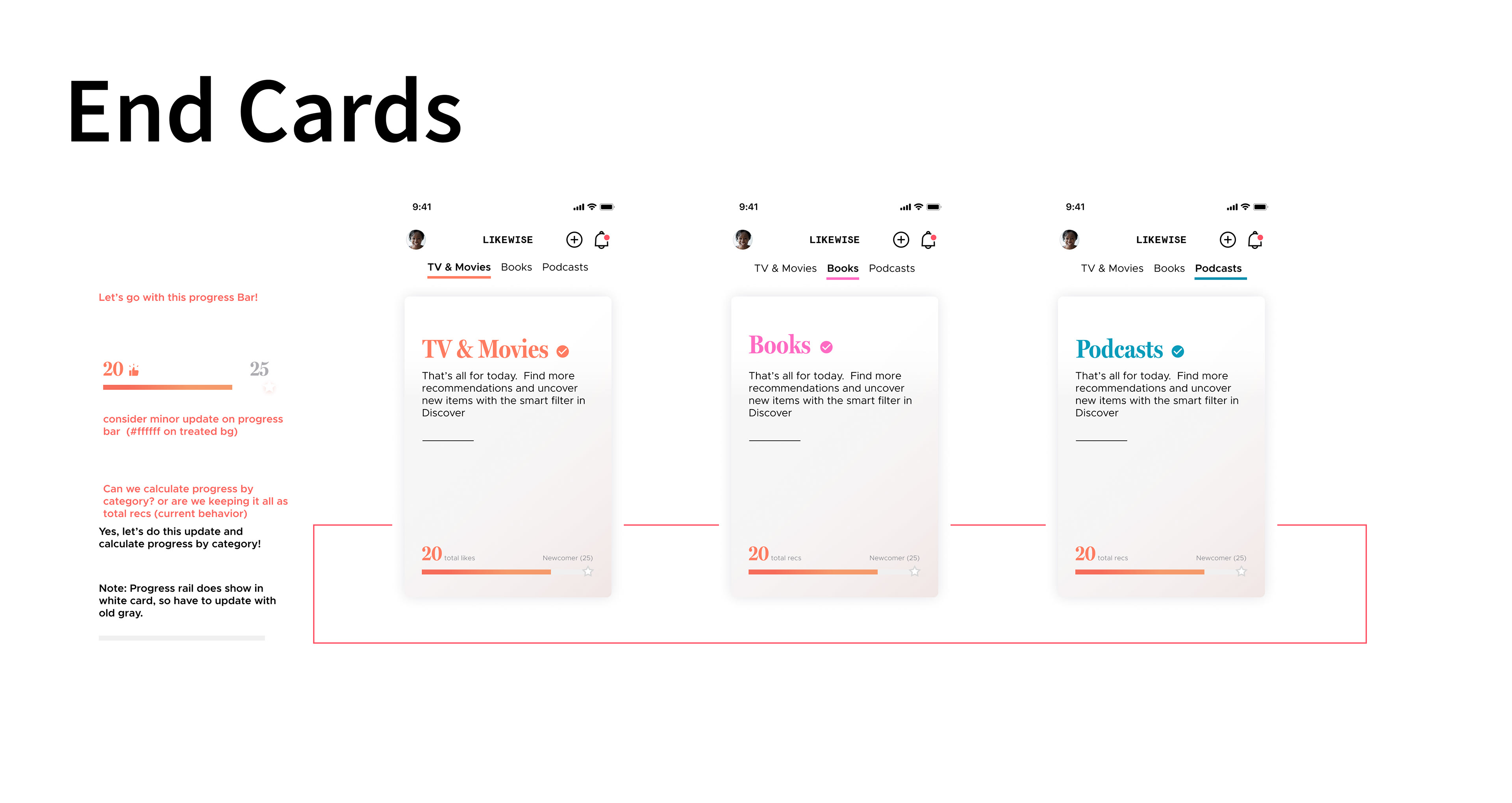
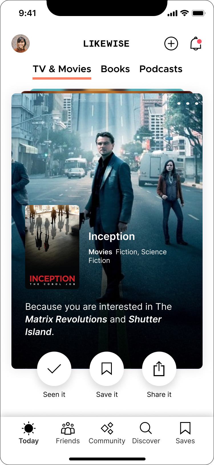
Optimizing the experience included refining initial card designs, transitions, UI updates and navigation.
High-fidelity Deliverables
We polished further details in visual design and presented it to stakeholders and our development team for final handoff.
High fidelity screens

Prototype
In addition to annotating, we used a prototype to communicate the nuances of the interactions with the development team and stakeholders.
*Prototype built by Israel Lemus
Post Launch Learnings
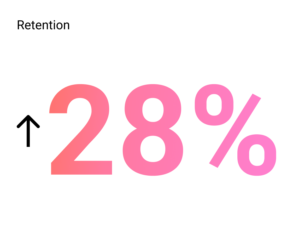
After launching the product we saw a 15% increase in engagement and retention rose to an all-time high of 28%
Even Though this was a successful solution, we found that users simply went through their full Today stack, but didn't go deeper in the product. We would continue to iterate and test cards to learn more